Katy Perry
‘Smile’
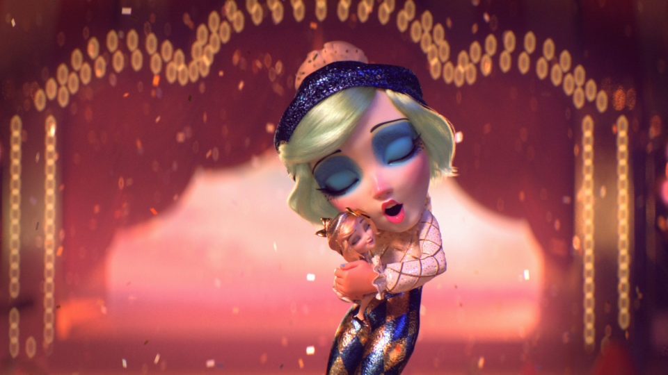
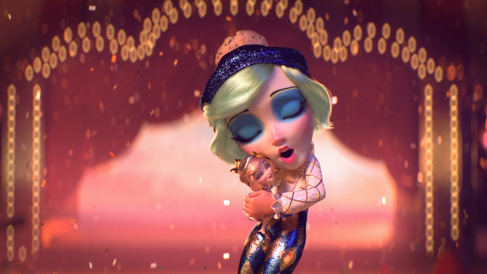
Production Company London Alley reached out about animating a high-profile music video. We were thrilled to learn it was for Katy Perry’s 2020 summer hit and album title track, ‘Smile’. We jumped on board with 6 weeks to complete the live-action and 3D video.
Creating this music video was equally about the story and the art. We organized the three-minute music video into 14 distinct scenes. Each scene underwent extensive development and design before creating 3D assets.
‘Smile’ has over 58 million views on Youtube. The music video was featured in publications around the world and continues to be a fan favorite.
Breakdown of a Scene
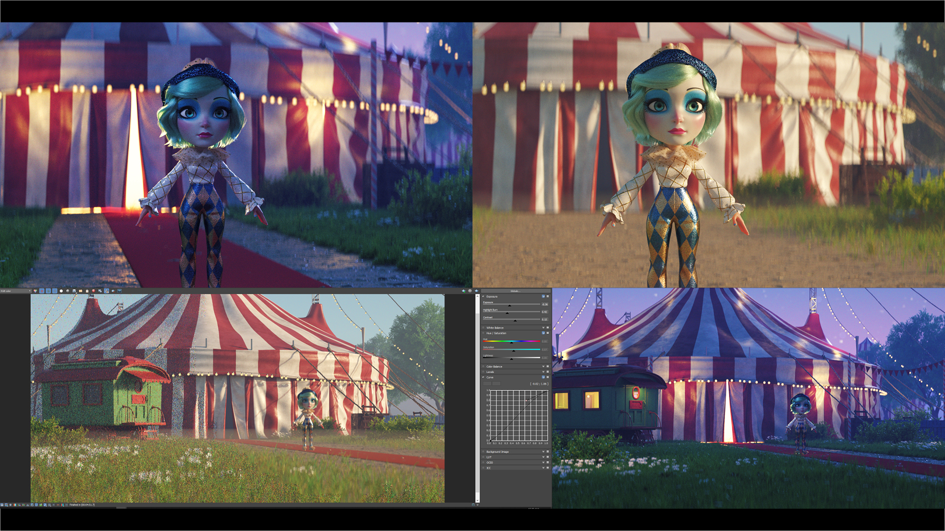
With so many beautifully detailed sequences in our film for Katy Perry, we’ve decided to take a tour through a few of our favorites, highlighting some of the finished frames, and sharing the journey that brought us there.
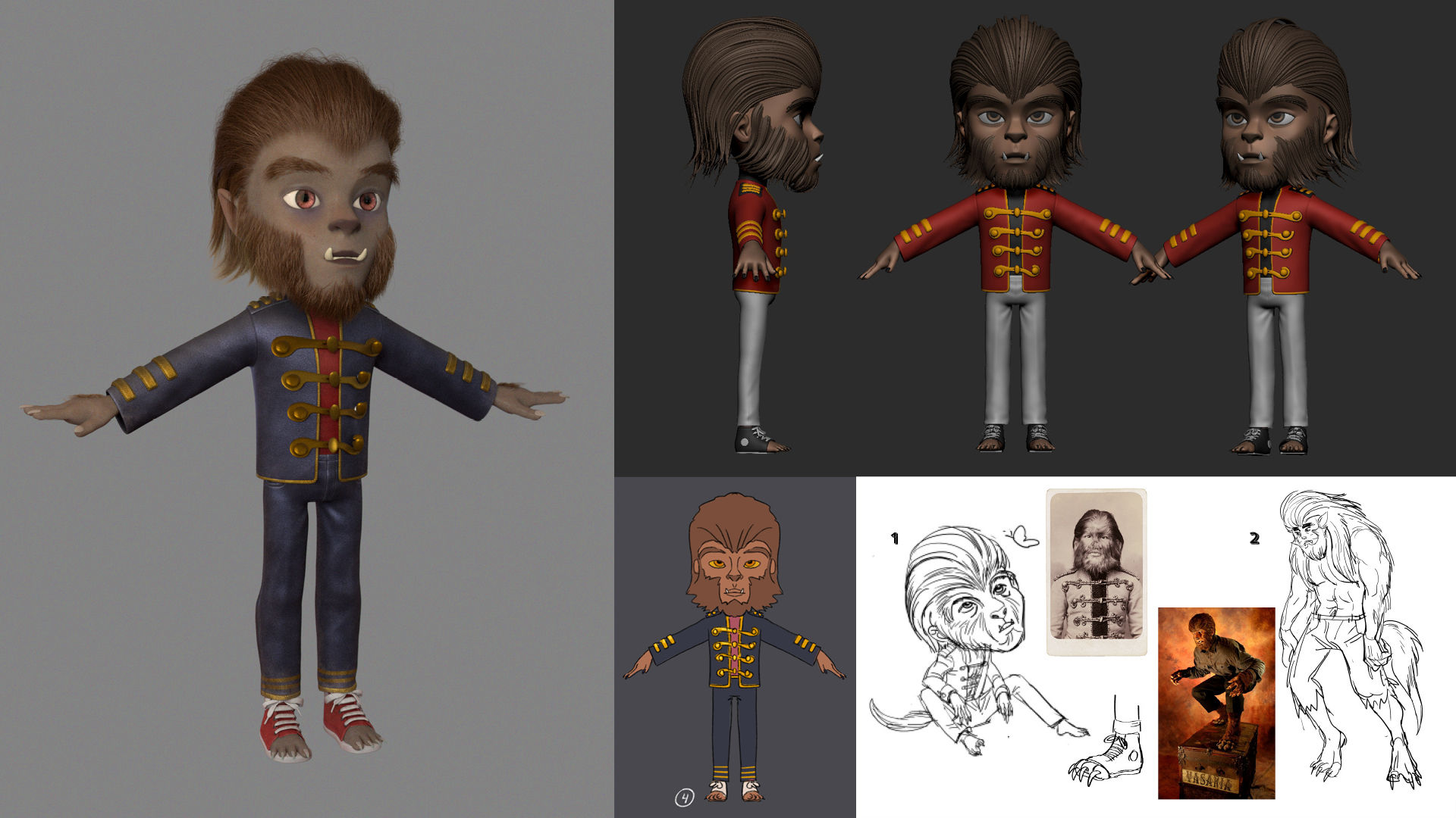
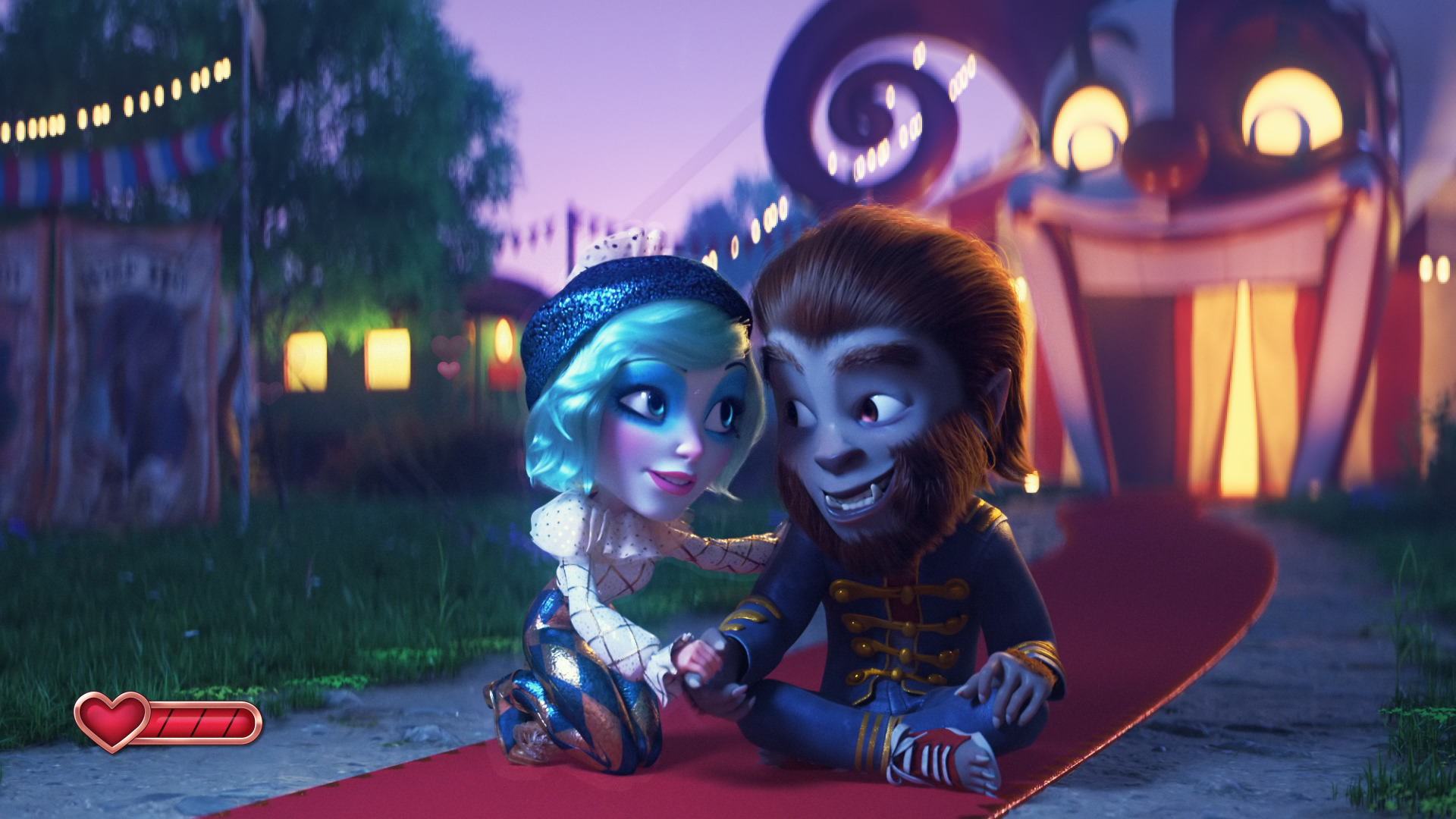
The WOLF BOY sequence
The WOLF BOY sequence is our entrance into the circus-themed video game world and represents Katy’s first challenge. Pulling this sequence together took the combined work of about 12 people. Director Mathew Cullen wanted the film to have a surreal and whimsical feel, which inspired us to create something special from the very first scene.
The Clown Race
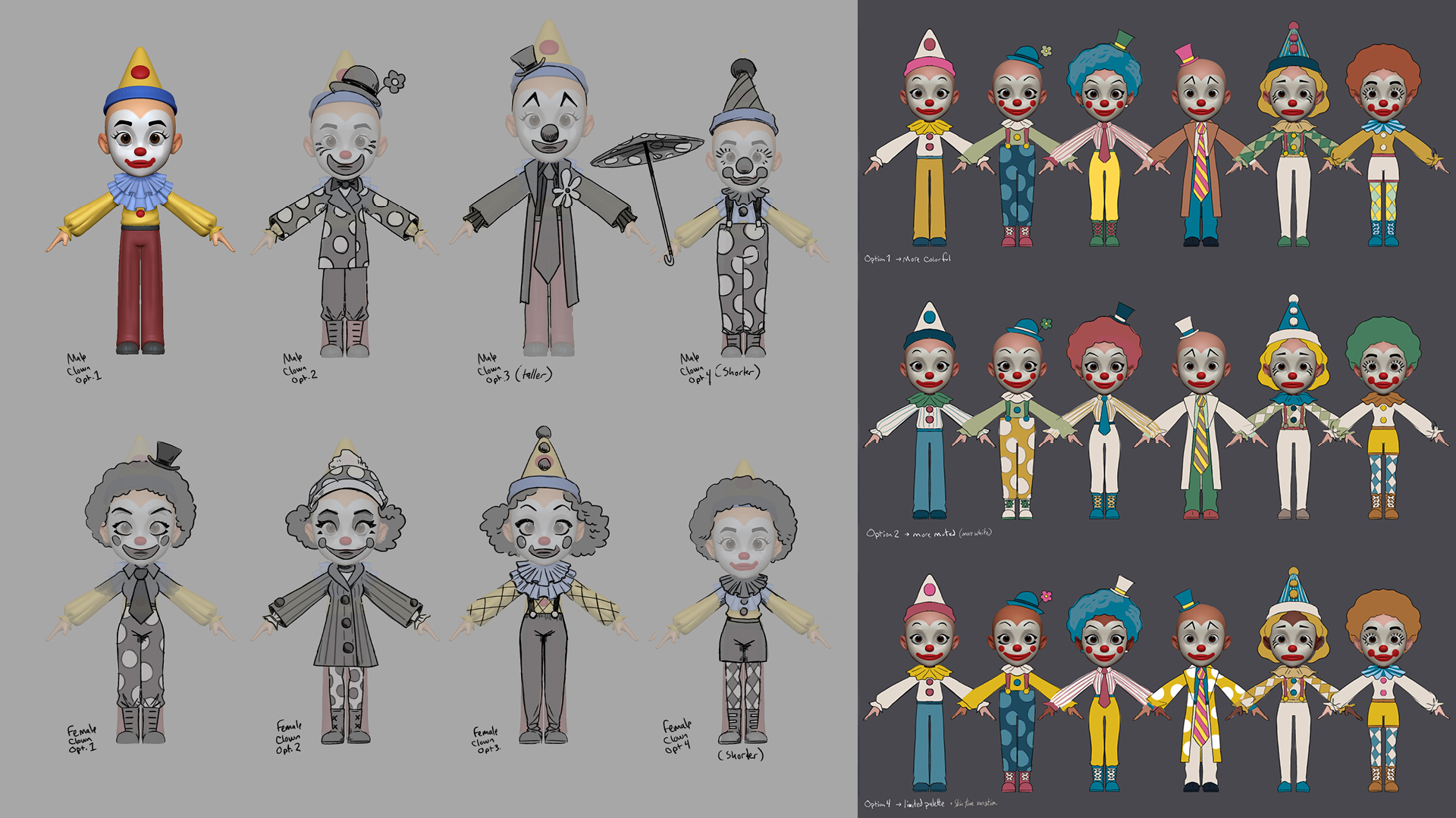
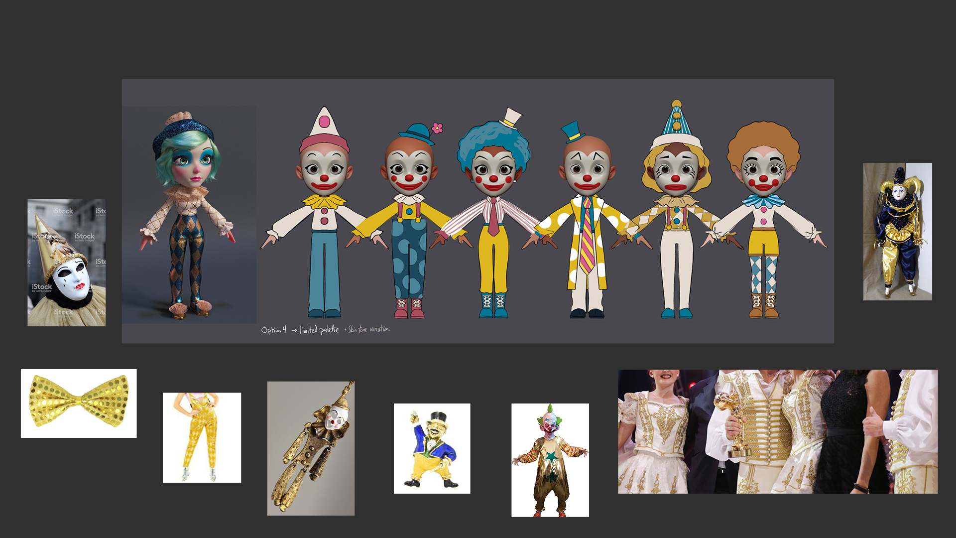
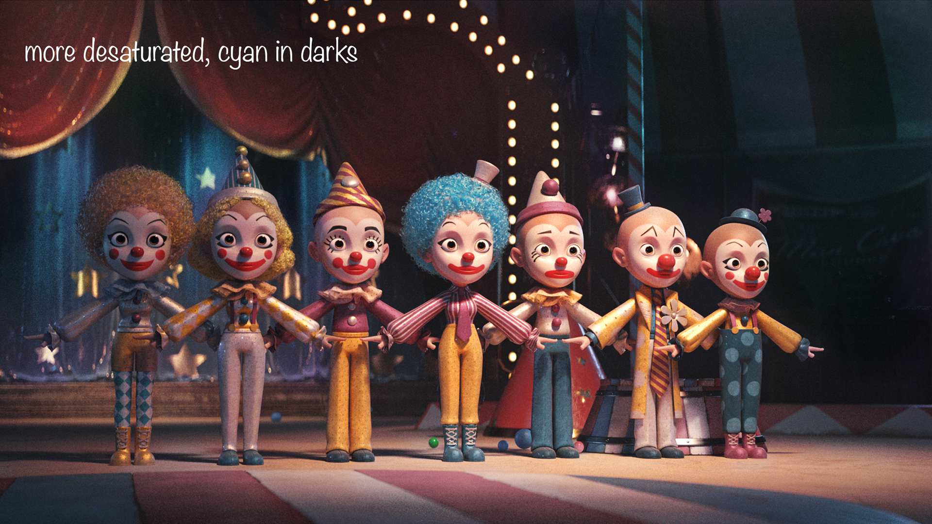
Creating the Clowns became a group effort between Production Designer Tim Probert and Flooul studio to develop a single, ideal clown that all variations could be built. Once that was established, Tim designed the rest and explored a range of color options before landing on an ideal palette to complement Katy and the rest of the Smile universe. The last step was materials, and early on we learned that Katy responded well to anything that glittered, so Director Pedro Conti handled look dev, letting each character shine in their own, unique way.
The Spidora Sequence
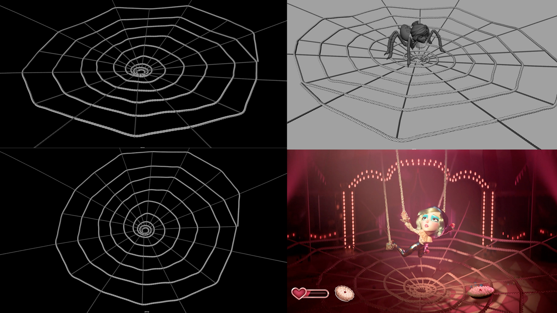
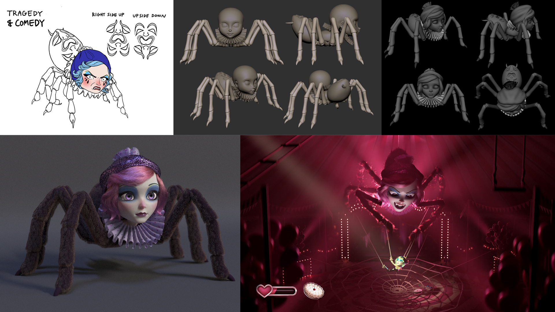
For the climax of our film, the SPIDORA sequence! This is where Katy Perry defeats the mega-boss and ultimately wins the game. A lot of thought, planning, and trial-and-error went into this dramatic conclusion to make it as satisfying as possible.
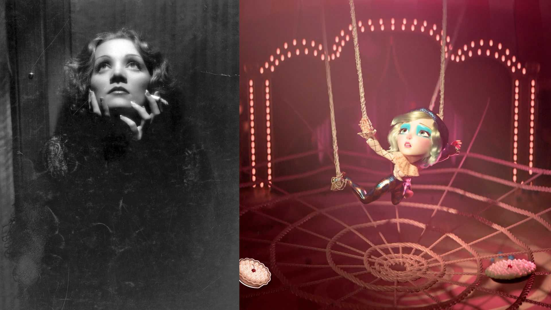
For Lighting, we discussed our favorite film noir and horror references, making sure our hero, despite being in distress, looked as beautiful as possible, and that our villain looked equally menacing and larger than life in contrast. Then, we worked to ensure that the two lighting scenarios would complement each other when the characters were seen together.
Additional Projects we collaborated with London Alley on:
let’s make magic together!
